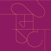
A branding project for a nerikomi artist, Moneshi Shah; starting out with her own brand - The M Project. Nerikomi is a Japanese technique where coloured clay is layered and sliced to make patterns, then shaped into objects which are glazed and fired. The logo encapsulates this process, through a stylised flame that also takes the shape of the letter "M," which is the initial of the artist's name. The colour palette and organic frame is inspired by Asian aesthetic and reflects the uniqueness of each hand-made piece. We did an in-house photoshoot to create assets and strategised for the brand's social media platforms. We also worked on the packaging, brochure, certificate of authenticity and thank you notes which carry the bespoke ceramicware.